Dashboard Development - Tableau and BRD
To manage the development of a self-service Tableau dashboard for the Regional Customer Retention Managers (RCRM) at a fictional financial institution, I drafted the Business Requirements Document (BRD) and developed the mobile-friendly dashboard.
My core strengths in this project include User Stories (US), Business Requirements, Acceptance Criteria (AC), and Dashboard Development.
*This project does not include an analysis.
Project Management - BRD
-
The current national attrition is X% higher than our target goal. The 5 Regional Customer Retention Managers (RCRMs) need to work together to bring it down, however, they do not have on-demand access to their region’s attrition rate or details about attrited customers.
To better empower the RCRMs, we need to develop the Attribution Dashboard. This is a self-service dashboard that offers on-demand access to regional KPIs and correlations.
Every RCRM will have access to their regional data and we expect them to develop strategies to decrease Attrition Rate in their lowest performing states.
On-demand access empowers the RCRMs to perform their own analysis and take the actions necessary to reach their goals.
-
Decrease the national attrition rate to X% by the end of the end of Q4.
A(n) X% increase in dashboard usage and a(n) X% decrease in ad-hoc data requests from the Regional Customer Retention Managers within 90 days post-launch.
-
“As a Regional Customer Retention Manager, I want access to attrition rates and attrited customer details in my region, so that I can identify areas of concern and correlations to develop targeted strategies for reducing attrition and improving customer loyalty.”
-
In Scope
Development of key metrics
Attrition Rates, State % of total
Training and Documentation
User Guide with metric calculation details
Resources
1 BI Analyst, 20 hours of work a week for 3 weeks (15 days)
Timeline
Requirements Gathering: 2 days
First Iteration: 3-6 days
First Iteration Presentation: 7 day
2nd Iteration: 7- 11 days
2 Iteration Presentation & Recorded Training: 12 day
Documentation, User Guide, and Final Delivery 12-15 days
Deliverables
Dashboard
User Guide
Out of Scope
Analysis
Regional Customer Retention Managers are highly analytical and do not require an analysis, instead they need a self-service tool.
New data integrations
-
Functional Requirements
BR-1: Real-Time Dashboard
Description: Develop a realtime dashboard to provide insights into:
Customer Attrition Rate (national, regional, state) and State % of Total Attrition Rate
Attrited Customer Details (Age, Months on Book, Education Level, Dependent Count, Income Category, Credit Limit, and Spending)
Metric Calculation Details, i.e. Example of how metrics were calculated
Priority: High
Owner: BI Analyst
BR-2: Customizable Filters
Description: Allow users to filter by state and region
Priority: High
Owner: BI Analyst
BR-3: Exportable
Description: Allow users to download dashboard as a PDF static image
Priority: Low
Owner: BI Analyst
Non-functional Requirements
BR-4: Security Compliance
Description: Implement role-base access controls to comply with organizational data security policies
Priority: High
Owner: IT Security Team
BR-5: Accessibility
Description: Allow users to access dashboard from their mobile device
Priority: High
Owner: Product Manager
-
The RCRMs can identify the States, both nationally and regionally, with a high Attrition Rate in yellow.
The RCRMs can identify the States, both nationally and regionally, with a low Attrition Rate in grey.
The RCRMs know the exact Attrition Rate for each state.
The RCRMs know the exact State contribution to the National Attrition.
The RCRMs know the Education Level, Credit Limit, Spending, Income, and Dependent Count of Attrited customers.
The RCRMs can get insights into the correlation between Credit Limit, Months on Book, Spending or Credit Limit and Attrition Rate
The RCRMs can get insights into the correlation between Dependent Count, Income Category, Spending, and Attrition Rate.
The RCRMs can get insights into the customers spending.
The RCRMs can access and interact seamlessly with the dashboard both on their desktop/laptop and mobile device.
-
Regional Customer Regional Managers - 5
Tableau Dashboard Development
Below I explain how I developed each chart and include a User Guide for each per the BRD.
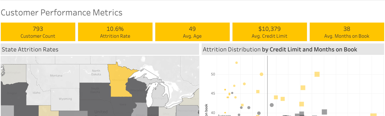
Customer Performance Metrics - Text Tables
The text table metrics were created with custom calculations. Each metric is on its own sheet so that different layouts (desktop, tablet, mobile) are easier to develop.
-
If the metrics for Desktop and Mobile need to look different, i.e no yellow background on Desktop:
Place a vertical container in the Default View
Hide container
Place Default vertical container in a horizontal container in Phone view
Make it visible
-
National metrics are the default view.
To make sure there are no state level filters applied:
Scroll down to the Map
Make sure no states are outlined.
If there is a state outlined:
Select/Tap the state
Once a state is no longer outlined, metrics will be at a national level
-
Scroll to “User Guide - State Attrition Rate”
State Attrition Rates - Filled Map
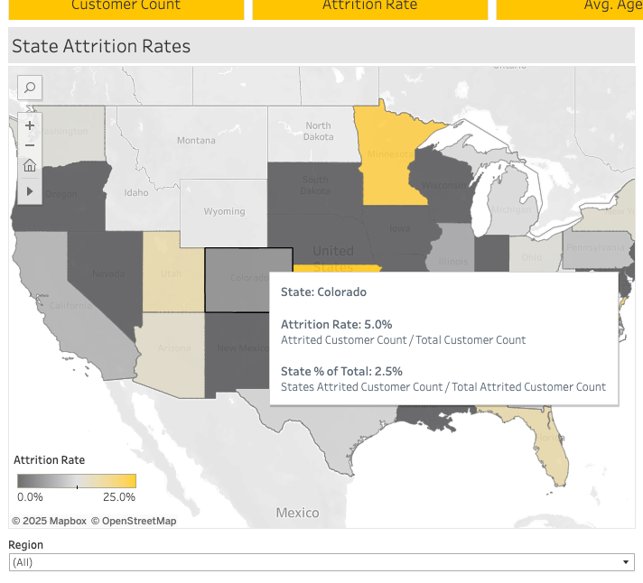
The Filled Map displays high level state metrics.
Attrition Rate and State % of Total were created with Custom Calculations. The metric calculation details appear in the Tooltip.
The Attrition Rate legend is edited to 0 - .25, since the highest Attrition Rate is 23.1%.
A Filter Action is used on this tile so that all other tiles filter on the selected state.
Regional Filter is available and applies to all sheets.
-
Locate Map (if not starting on Map view)
To filter all metrics and charts on a region:
Locate Region filter (below map)
Select/Tap on filter
Select/Tap on desired region
On mobile:
Tap ‘(All)” to deselect all
Tap on desired region
Tap “Apply”, selected region is outlined and filled
On desktop:
Click Region filter
Check the box for desired region
Click on the map to hide the filter drop-down, selected region is outlined and filled
Top metrics and all charts are now filtered on selected region
Tooltip is available for each state in selected region
To view state Tooltip on mobile
Tap desired state
Metrics and charts filter on tapped state
To go back to region metrics, tapped selected state
Previously selected region is filled and outline
Metrics and charts are not filtered on region
To view Tooltip on desktop
Hoover over desired state, Tooltip displays
To filter on a state, click a state
Metrics and charts are now filtered on selected state
To go back to Region filtering, click the previously selected state
Tooltip displays the following:
State: State Name
Attrition Rate: Attrition Rate for selected state
Attrition Rate Calculation: Attrited Customer Count / Total Customers
State % of Total: Selected State contribution to the national Attrition Rate
State % of Total Calculation: State Attrited Customers / Total Attrited Customers
To filter on a different region:
Locate Region filter (below map)
Select/Tap on filter
Select/Tap on desired region
To Zoom In
Area Zoom In:
Pinch out with 2 fingers
State Zoom In
Tap on Magnifying Glass icon (top left)
Start typing desired state
Click desired state
To Zoom Out
Mobile
Pinch in with 2 fingers
Tap Home icon (4th down on left). This icon only populates at a specific zoom in level.
-
Locate Map (if not starting on Map view)
To filter all metrics and charts on a desired state:
Select/Tap on a state
Selected state will be outlined
Tooltip displays and contains:
State: State Name
Attrition Rate: Attrition Rate for selected state
Attrition Rate Calculation: Attrited Customer Count / Total Customers
State % of Total: Selected State contribution to the national Attrition Rate
State % of Total Calculation: State Attrited Customers / Total Attrited Customers
To get rid of Tooltip and:
Show metrics for selected state
Select/Tap “Keep Only” OR
Select/Tap anywhere on the dashboard outside of any tile
Exclude selected state from metrics
Select/Tap “Exclude”
Default to national metrics
Select/Tap “Clear Selection”
Tap on selected State
To filter on a different state:
Select/Tap on different state
Metrics will populate for that state
To go back to national metrics:
Select/Tap currently selected (outlined) state
Select/Tap “Clear Selection” if Tooltip is still visible
To Zoom In
Mobile
Area Zoom In:
Pinch out with 2 fingers
State Zoom In
Tap on Magnifying Glass icon (top left)
Start typing desired state
Click desired state
Desktop
To Zoom Out
Mobile
Pinch in with 2 fingers
Tap Home icon (4th down on left). This icon only populates at a specific zoom in level.
Desktop
Attrition Distribution by Credit Limit and Months on Book - Scatter Plot

The Scatter Plot provides customer details for the Attrition Distribution relationship between Avg. Credit Limit, Avg. Months on Book and Spend or Avg. Credit Limit.
The Metric Swap feature (bottom right) enables users to changed the shape size based on either Spend and Avg. Credit Limit. This feature is based on a logical parameter calculated field. (Tableau Hack #2)
The Highlight Region enables the end users to highlight the Attrition Distribution for a specific region.
National or Regional Average lines are featured as a reference point.
-
Parameters are dynamic values that can be used to modify a visualization, calculation, or filter.
They enhance user interactivity and make dashboards more dynamic.
-
Distribution represents National Distribution
To highlight a specific Region:
1. Select/Tap Region drop-down
2. Select desired Region
For Mobile, Tap Apply
3. View now represents selected Region
Avg. Credit Limit is the default shape size, but can be changed to represent Spending
To change size based on Spending:
1. Tap/Click the Metric Swap drop-down
2. Select Spending
3. Shape size now represents Spending
The Average lines reference the National Average OR the Average for the selected customer (shape)
To view customer details:
Hover on a shape (circle or square, yellow or grey)
Tooltip pops up and displays:
Education Level
Region
Avg. Credit Limit
Avg. Months on Book
-
Displayed Distribution is based on the Map’s selected State
Region filter does not effect this visualization. Region filter defaults to the selected State’s region.
Avg. Credit Limit is the default shape size, but can be changed to represent Spending
To change size based on Spending:
Tap/Click the Metric Swap drop-down
Select Spending
Shape size now represents Spending
The Average lines reference the State Average OR the Average for the selected customer (shape)
To view customer details:
Hover on a shape (circle or square, yellow or grey)
Tooltip pops up and displays:
Education Level
Region
Avg. Credit Limit
Avg. Months on Book
Customer Attrition - Highlight Table

The Highlight Table explores the relationship of Customer Attrition to Dependent Count, Income Category, and Spending.
Dependent count was originally exported as a continuous Measure . To use it as a Dimension, right click on it, select “discrete”, then drag it up to the Dimensions section.
The Tooltip features the exact Attrition Rate for each section and how it is calculated. Additionally, is clarifies that the $ in each box represents Spending.
Gantt Bar Graph
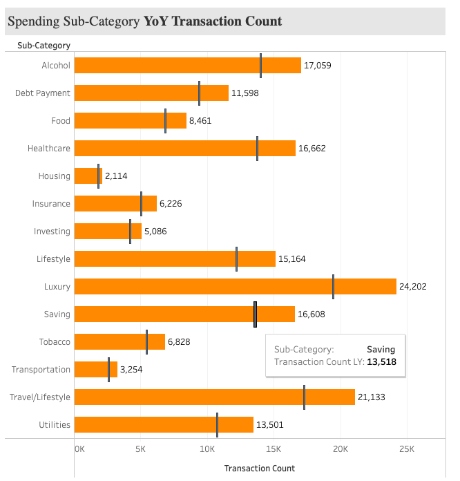
The multi-axis chart compares the Sub-Category transaction count for last year (LY) to the transaction count this year (TY).
Selecting Transaction Count TY, Transaction Count LY, and Sub-Category defaults to 2 Horizontal Bar charts. However, right clicking on either Measure, then clicking “Dual Axis” places both Measure fields on the same axis.
Change one Mark Type to Bar and the other Gnat Bar. Right click on X-Axis and click “Synchronize Axis” so both Measures are lined up.
The Tooltip for Last Year displays the Sub-Category and the Transaction Count, the value for Transaction Count TY is always visible.